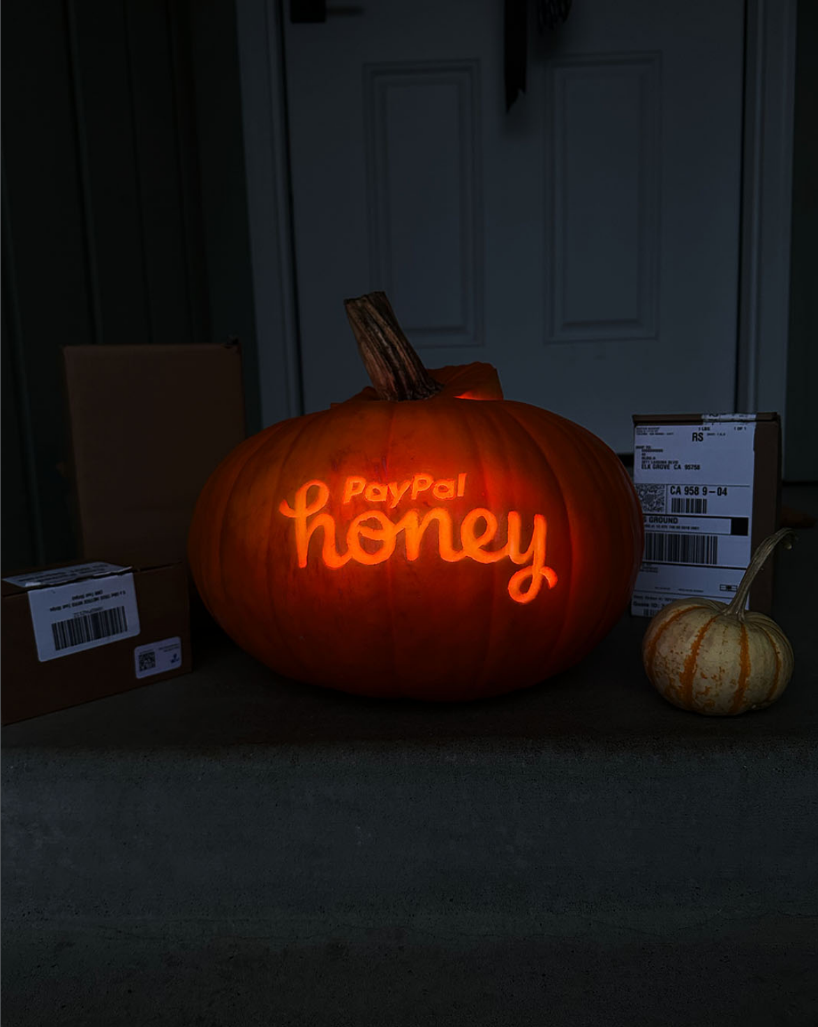
I joined Honey’s organic social team as a graphic designer but over time I took on the responsibility of creating video content as well. My role shifted to hybrid creative, contributing illustrations, design, video and photo content to their social team. While there I also developed the organic social brand guidelines. I had a lot of fun and got up to a lot of shenanigans.


ORGANIC SOCIAL














ILLUSTRATIONS



SOCIAL GUIDELINES
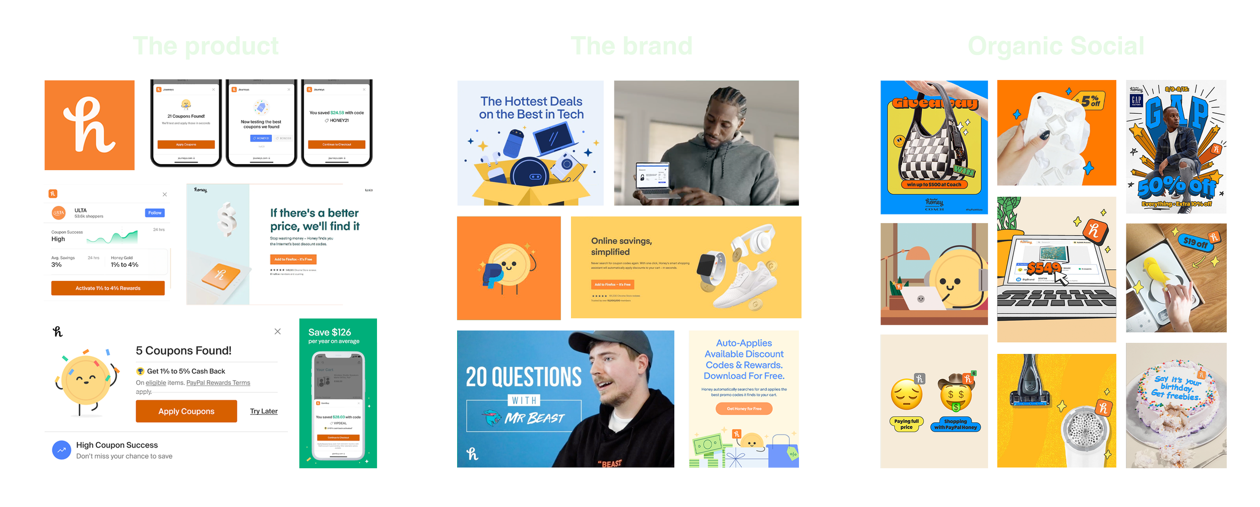
Organic social is unique from other forms of marketing. It’s driven by user generated content, trends, and engagement. Translating the brand to social required some liberties to be taken while also staying true to Honey’s identity.
Typography
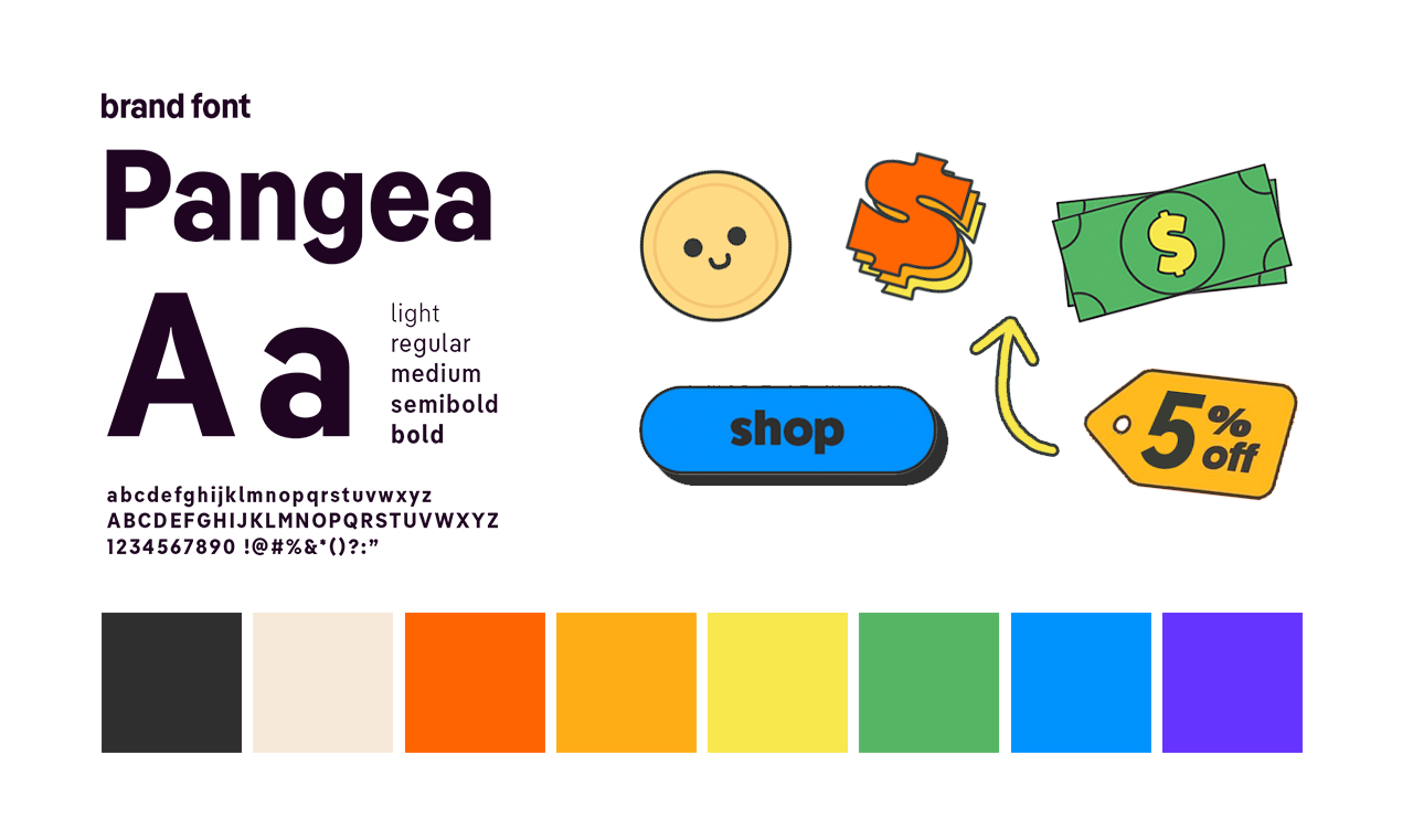
The Honey brand was limited to just one font - Pangea. This font is versatile but lacks personality. In addition to Pangea, I added 8 heavy for it’s fun groovy feel and FatFrank for bolder legibility. Pangea was reserved for brand forward moments and lengthy blocks of text.



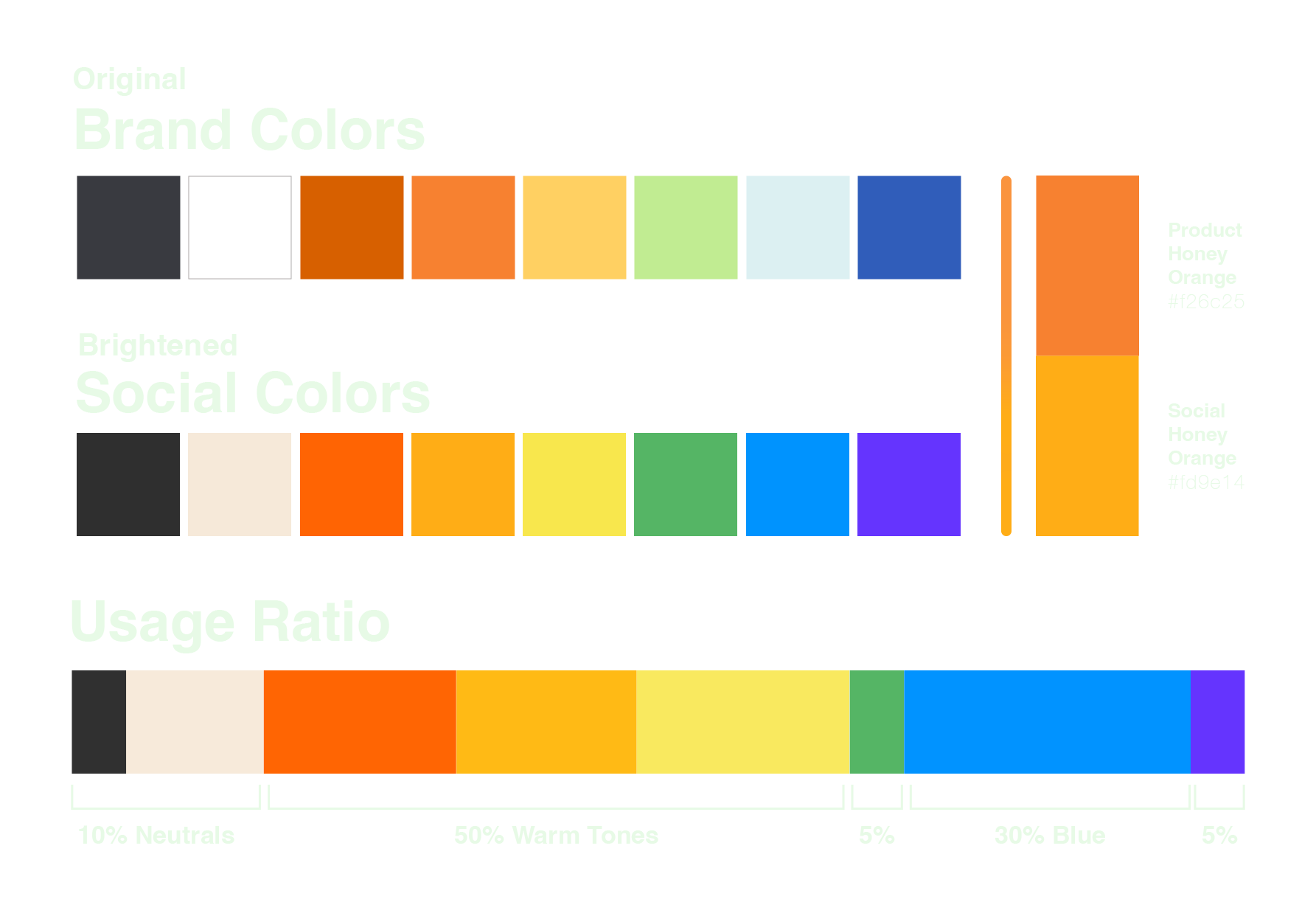
Color Palette
Shifting the saturation of the brand colors made Honey’s content more visible in people’s feeds. Since we are working with a whole rainbow of colors, a ratio guide was created to keep the feed on brand.



Illustration
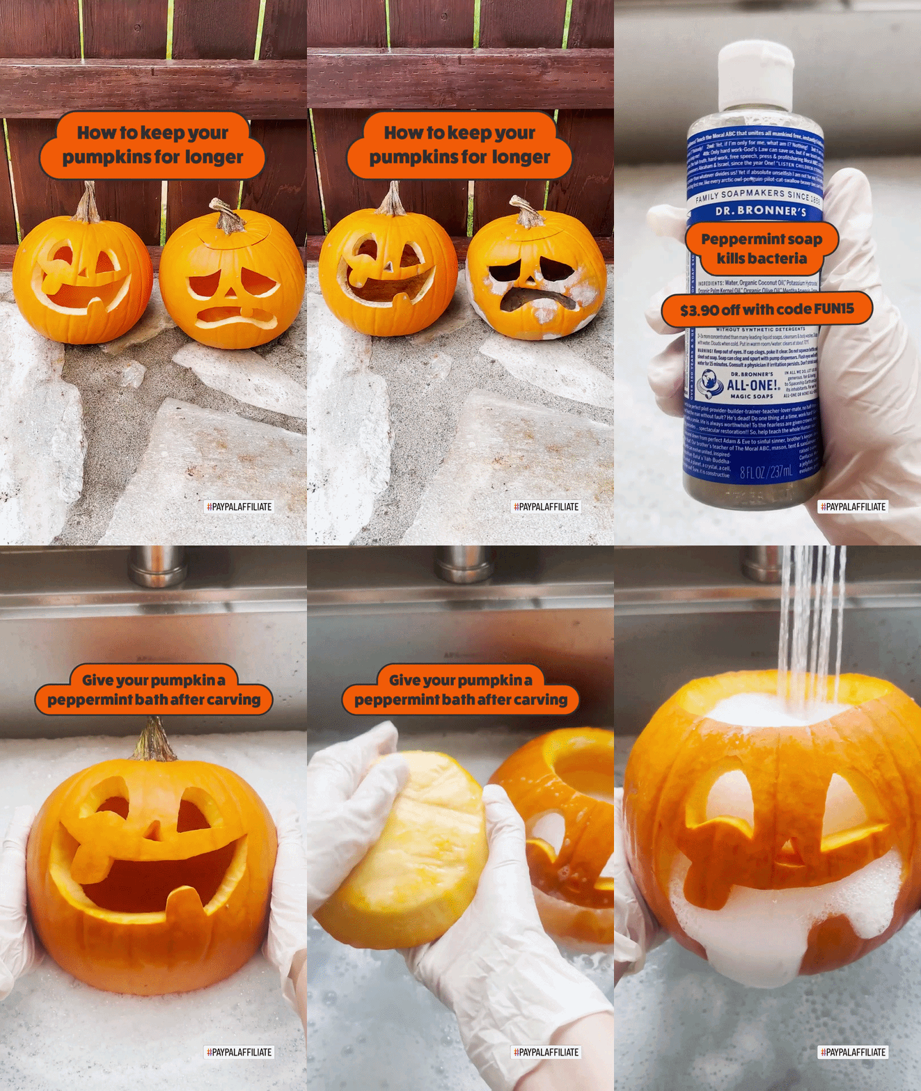
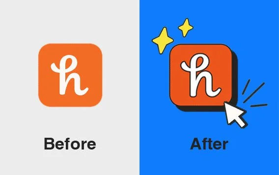
Illustration is a big part of the Honey brand. The brand book uses color block shapes but for social I added a black outline to everything. This helped the illustrations stand out more, and prevented colors from clashing.


Photography
Organic content is created on a phone to give it an authentic user generated feel. It’s elevated with good lighting and attention to detail, but still attainable. Photography credit Rachel Puchkoff